Archer
Artisanal Meat Snacks
Branding & Identity, Packaging



Lit Advertising: Gold, Rebrand; Silver, Brand Transformation
Shorty Awards: Winner, Brand Identity
Muse Awards: Silver, Brand Transformation
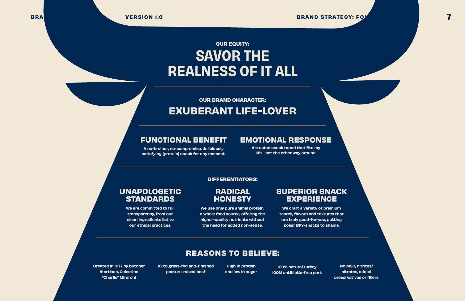
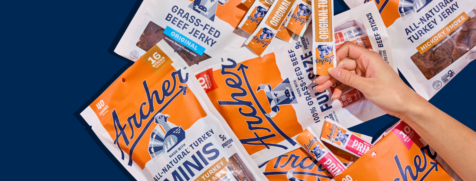
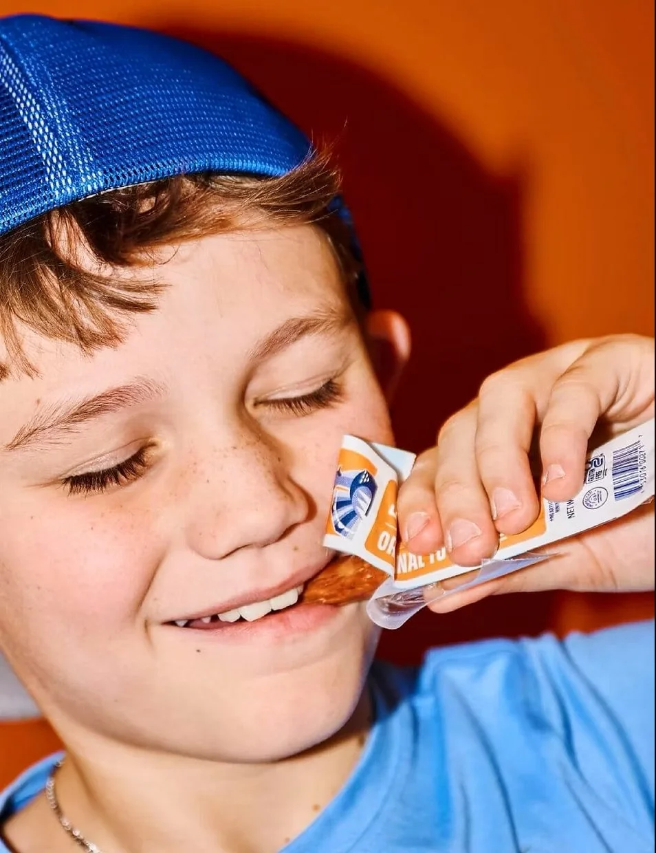
Archer (formerly Country Archer) came to us at an inflection point—facing low brand awareness, poor customer retention, and a visual identity rooted in a traditional jerky category that no longer reflected its product or ambition. Through brand strategy, renaming, and a comprehensive identity and packaging redesign, we repositioned Archer to speak to an under-served audience of health-conscious, gourmet-foodie snackers. By thoughtfully retaining elements of brand equity while introducing a more modern, better-for-you visual language, we helped transform perception and performance—driving nearly 2x YoY sales growth, expanded distribution, and a platform for national campaigns and partnerships, including the LA Dodgers.
Team: Brian Priest, SVP Strategy; Sean Morse, Sr. DD; Jerimy Lumia, DD; Shelby Tansil, Sr CW; Charlotte Weigel Sr. CW; Alexandra Dodge, Designer

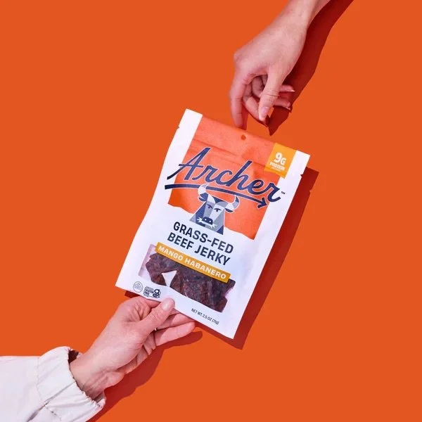
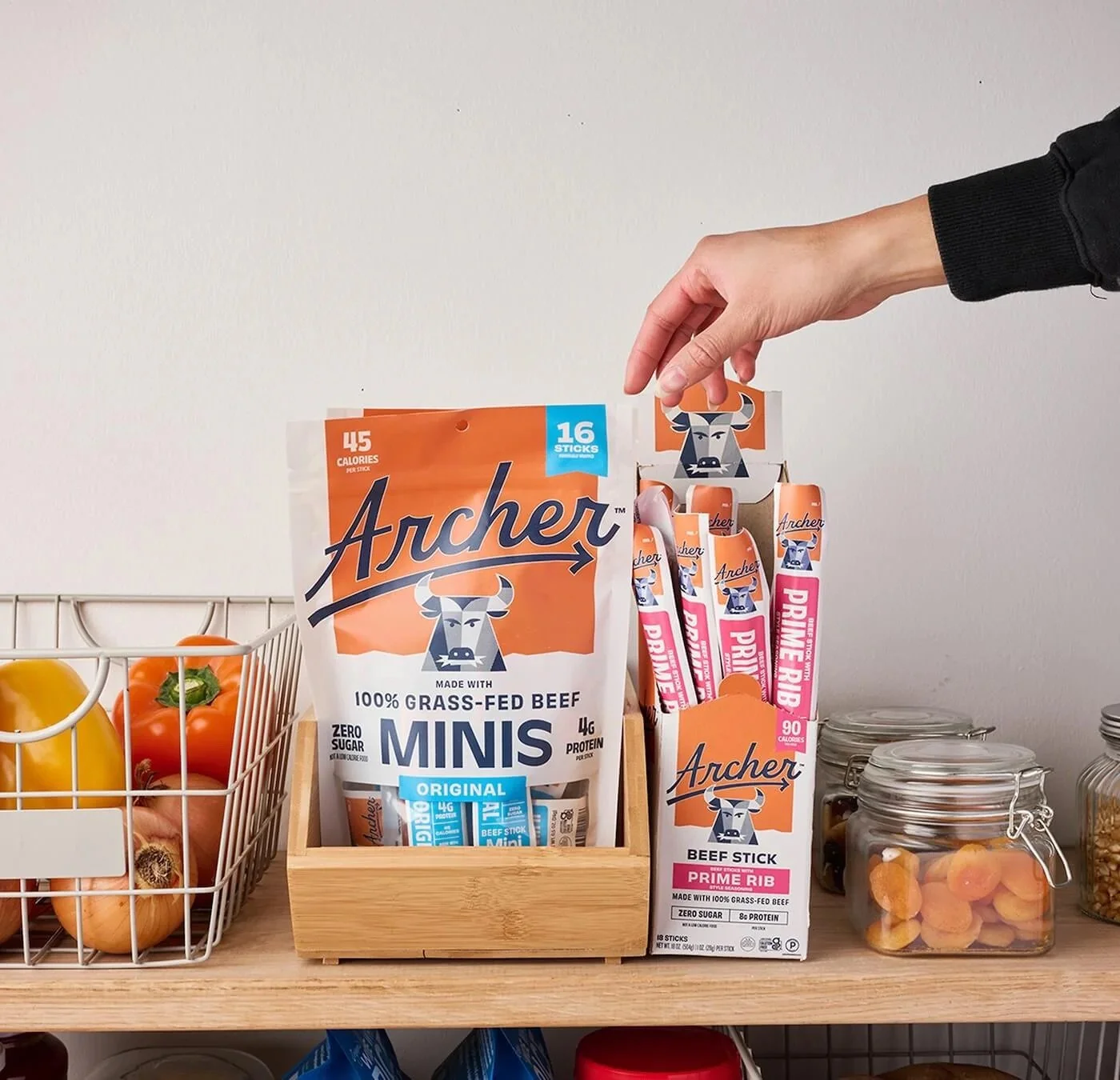
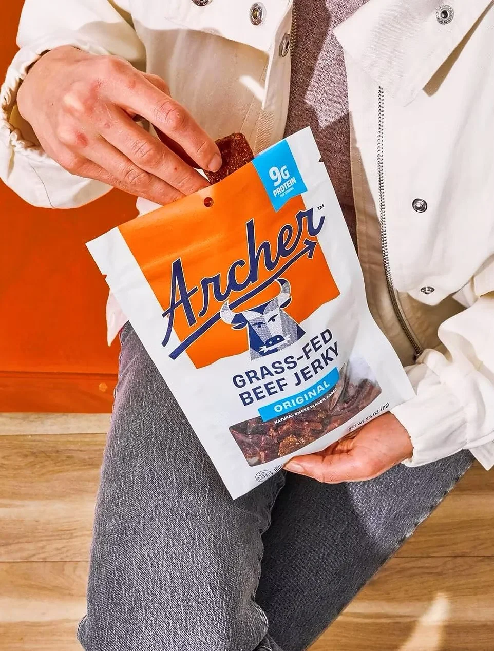
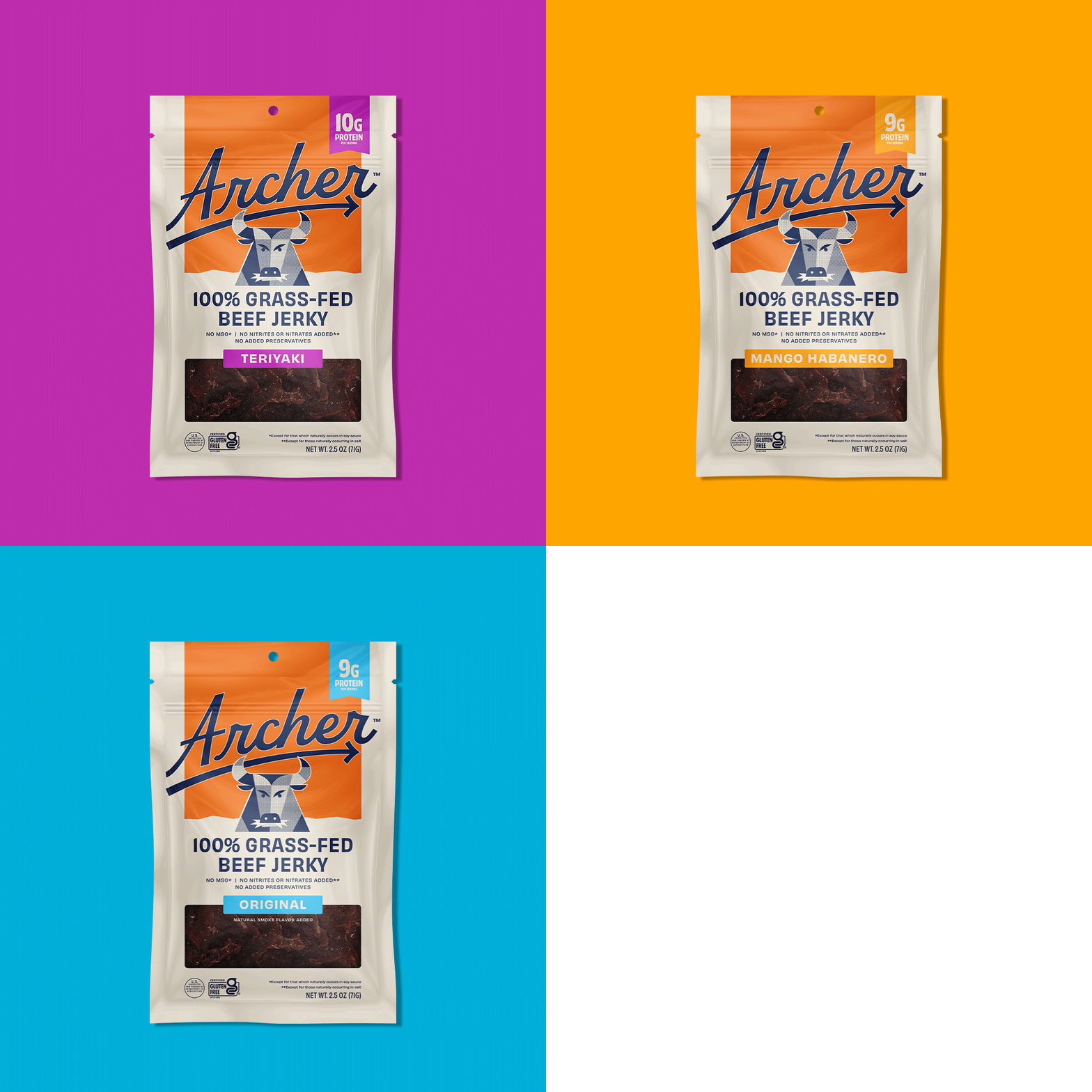
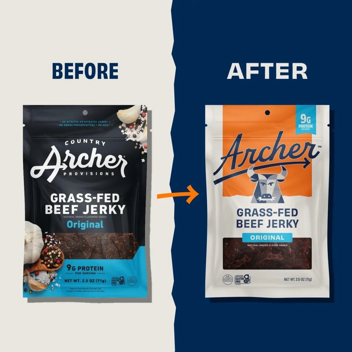
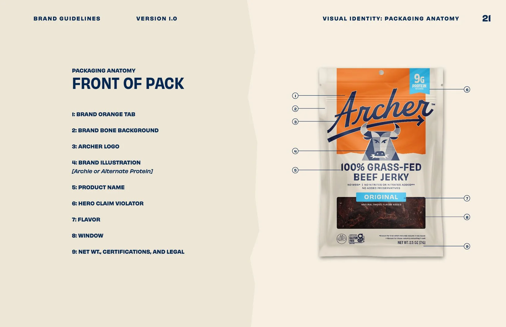
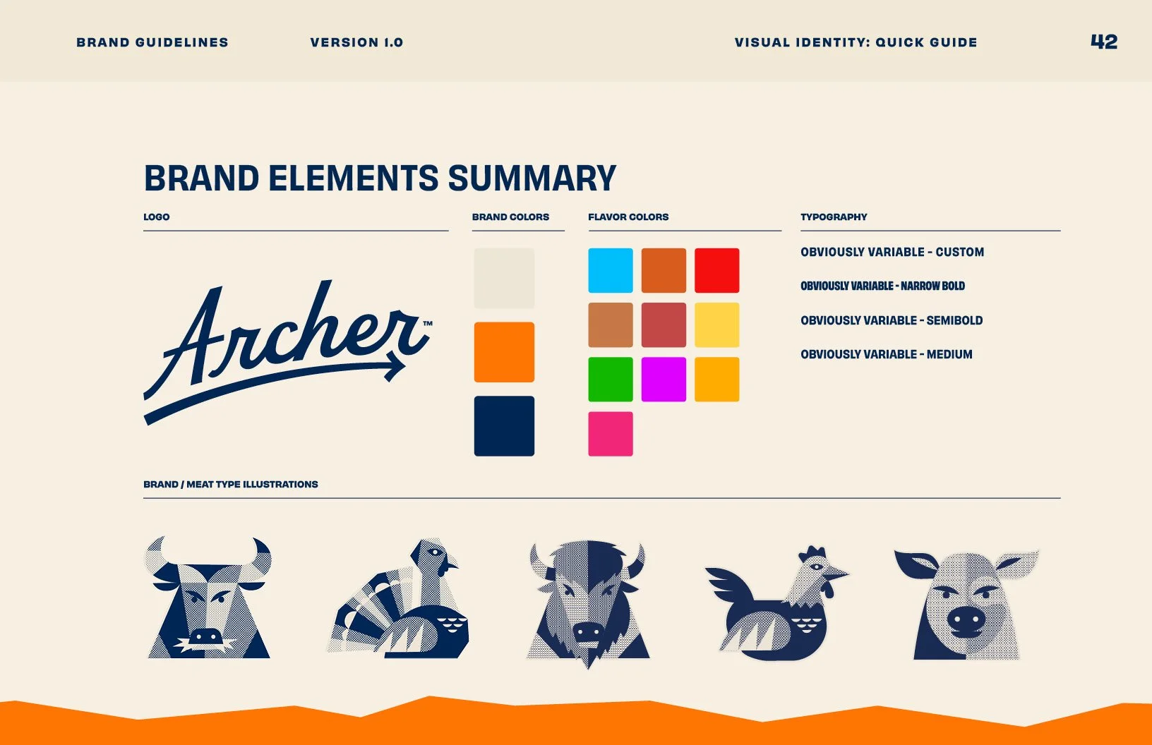
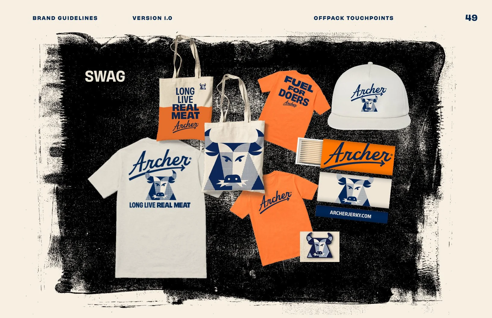
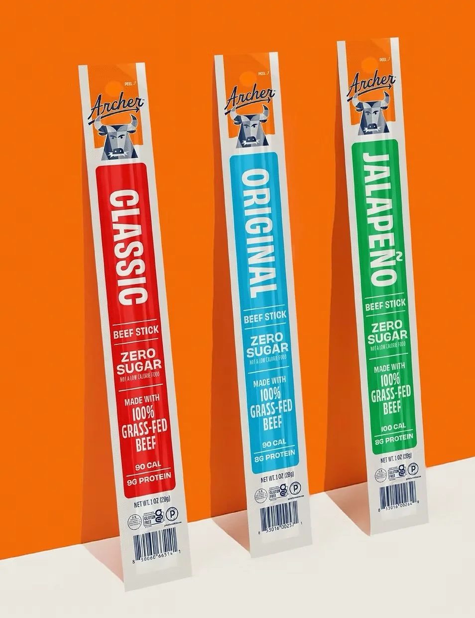
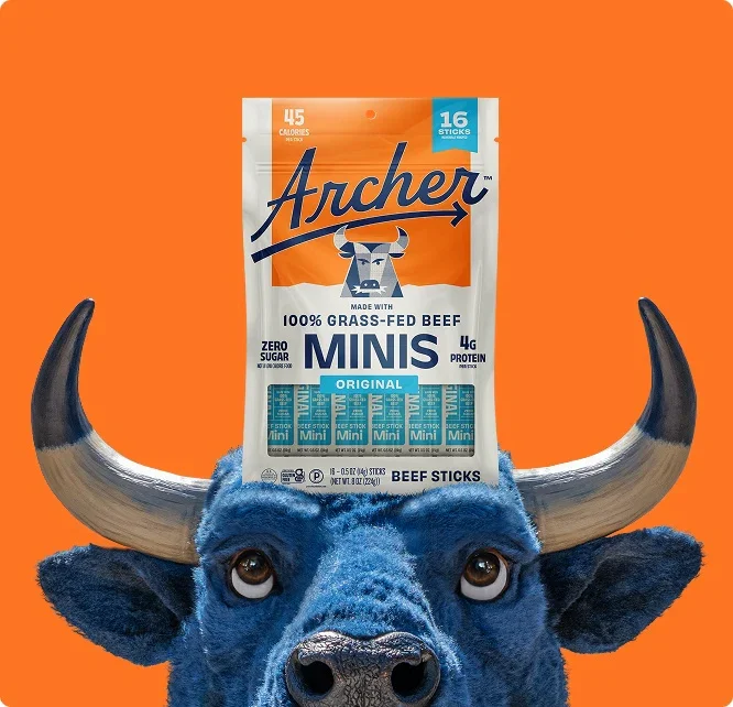
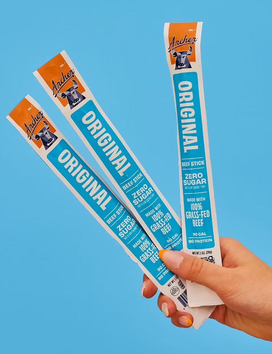
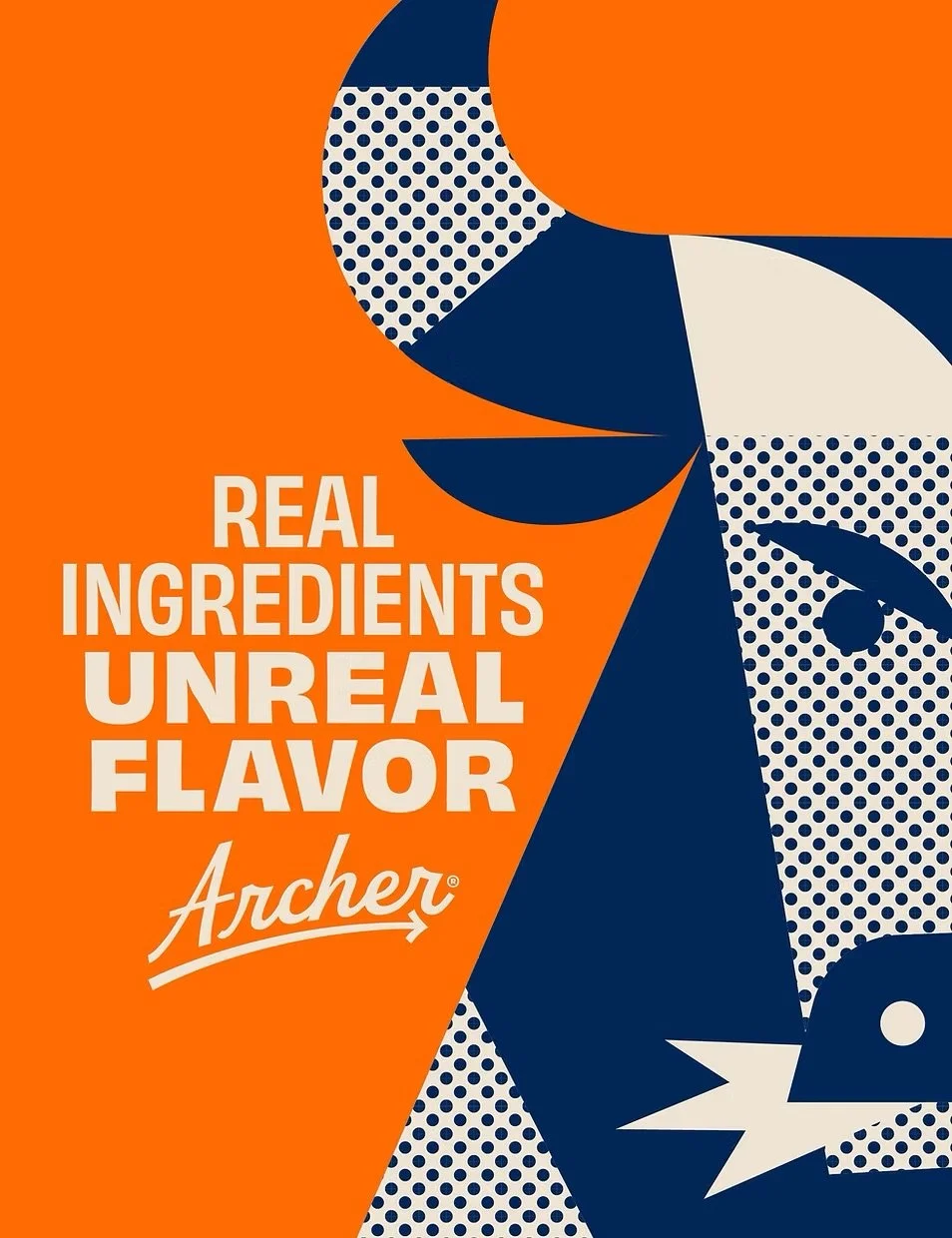
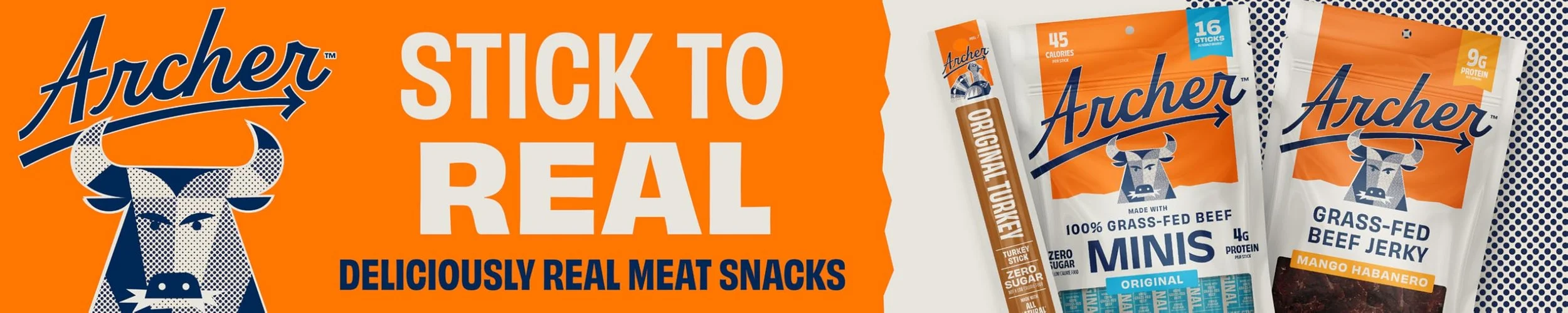
The packaging system was reimagined to break from the dark, crowded visual language of the jerky aisle. A light, off-white base cues a better-for-you positioning, while a bold orange acts as a distinctive brand beacon. The logo stretches confidently across the pack, paired with a simplified flavor architecture and a clear product window. Introducing the Blue Bull mascot added personality and memorability, creating a flexible system that extends seamlessly across SKUs and marketing touchpoints.
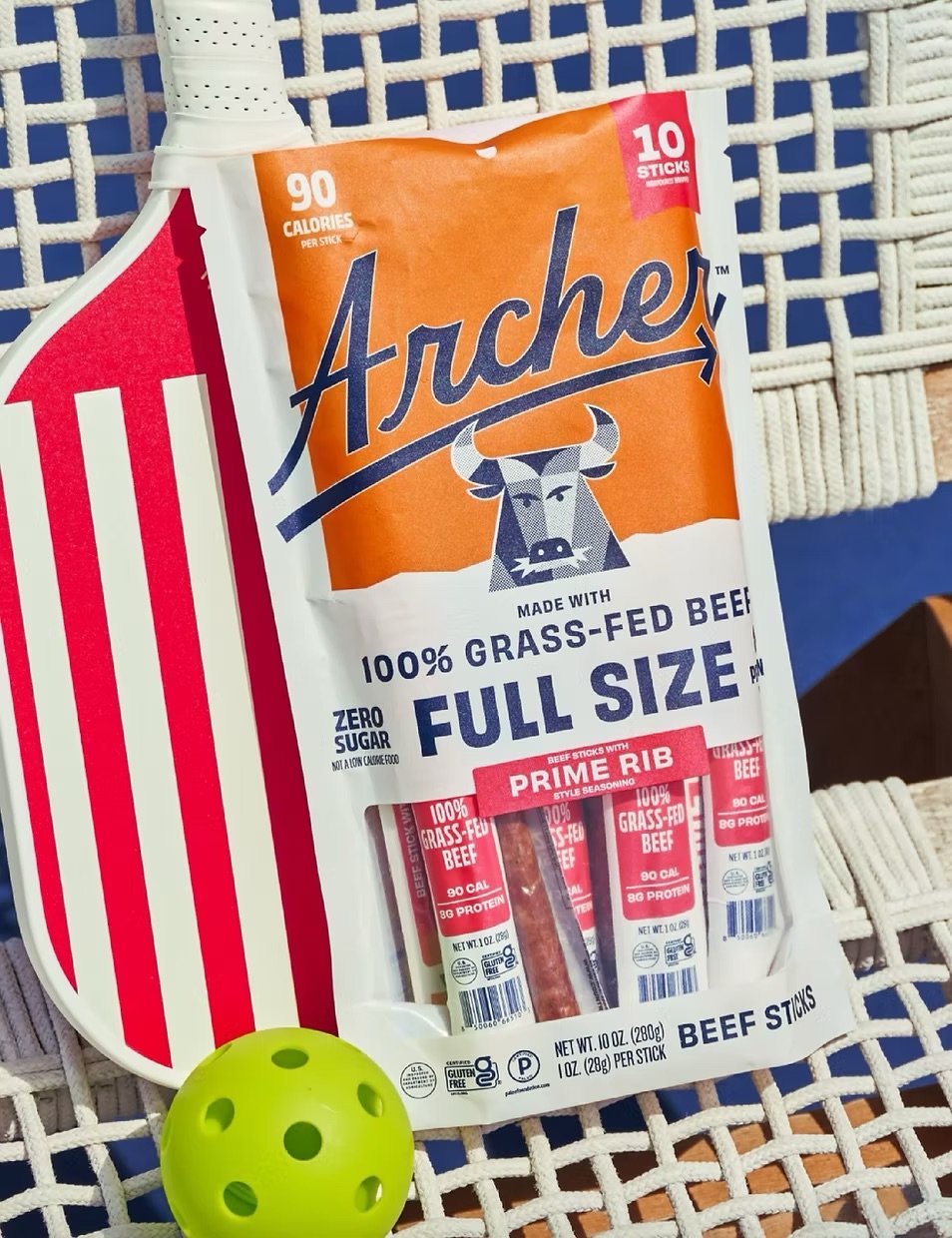
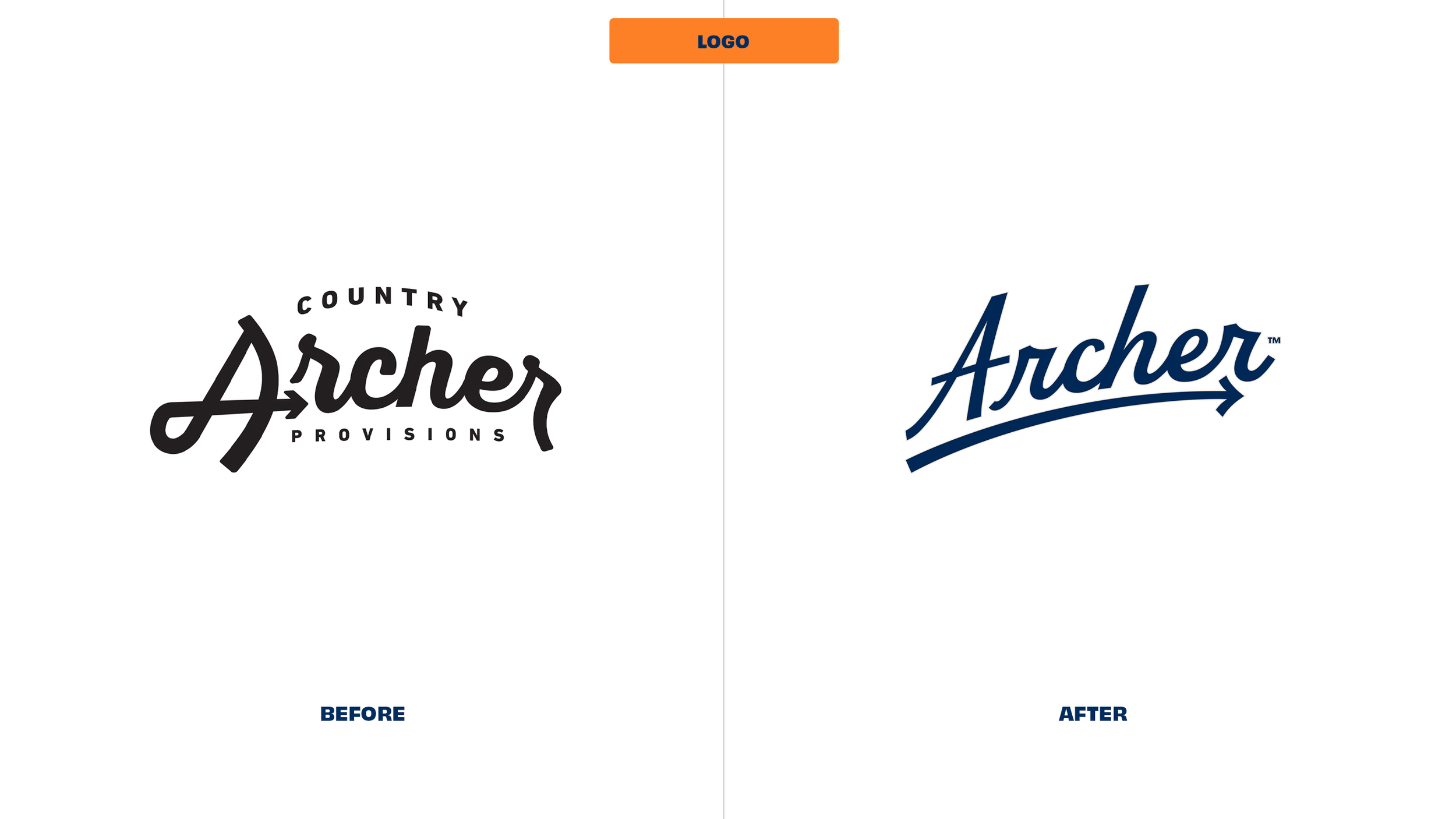
Logo
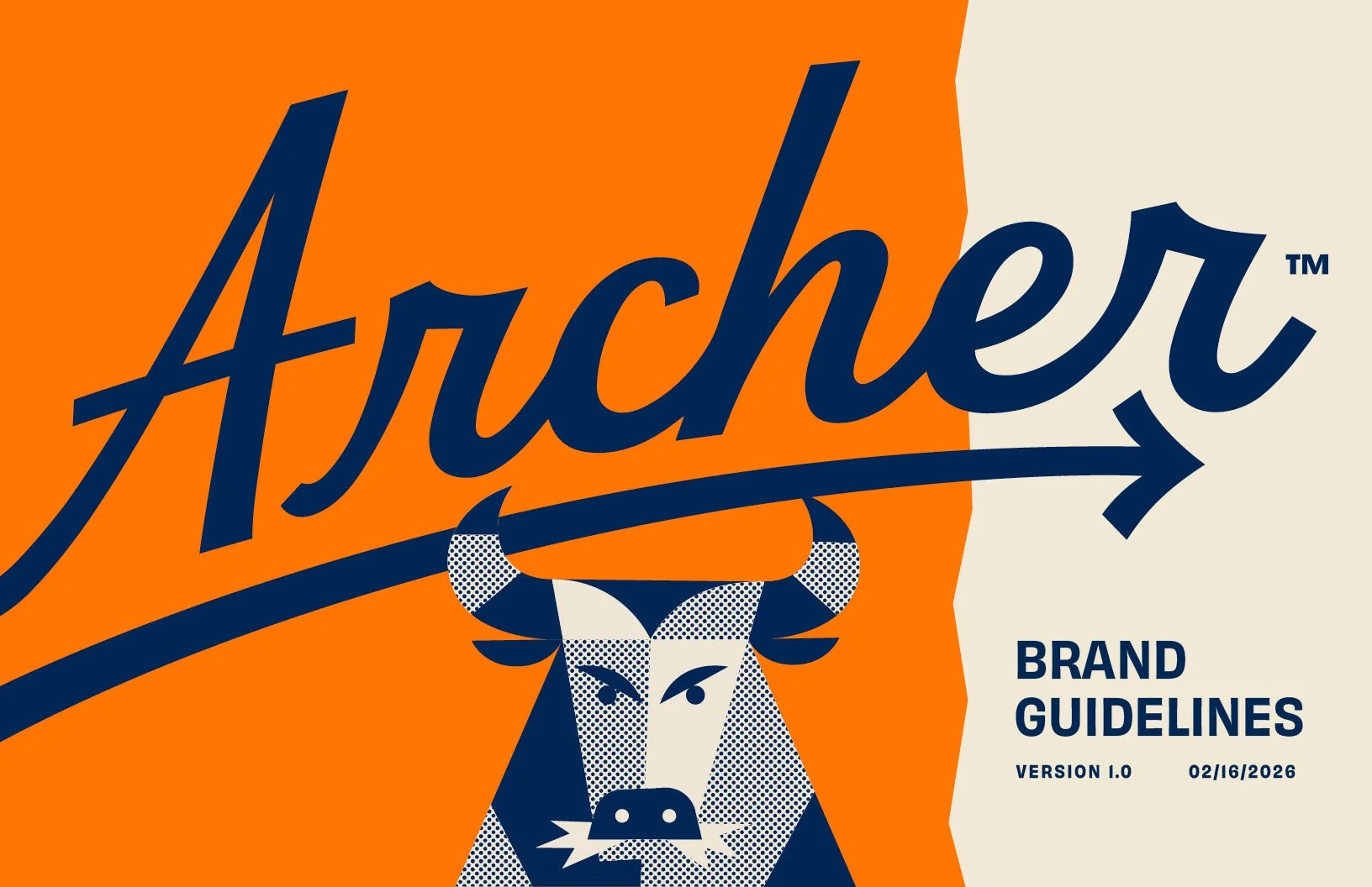
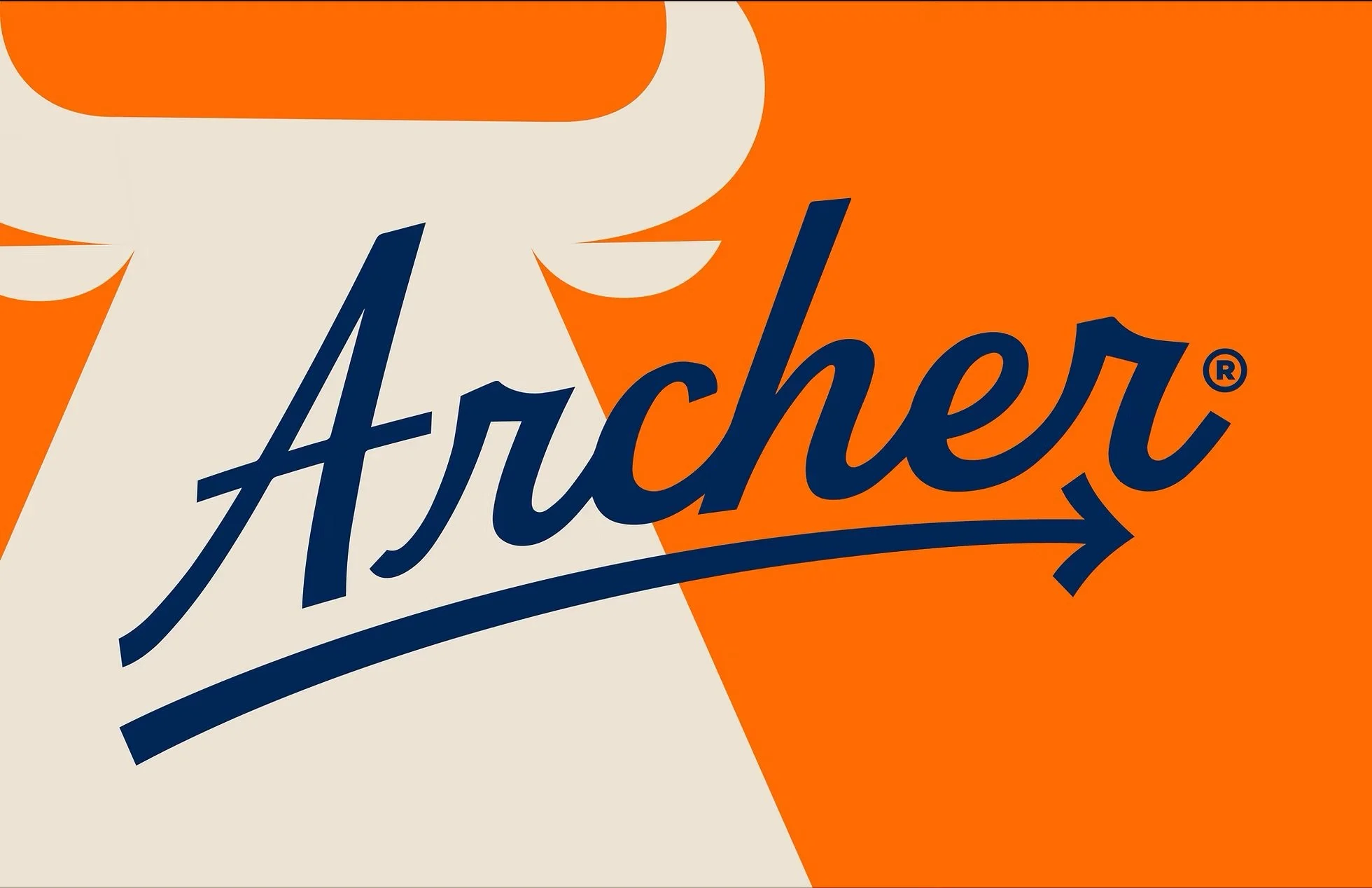
The wordmark was evolved into a more refined, energetic expression—retaining recognizable structure while elevating it with sharper detailing and improved balance. The result is a mark that feels more premium and forward-moving, preserving brand equity while signaling a clear shift away from category conventions.
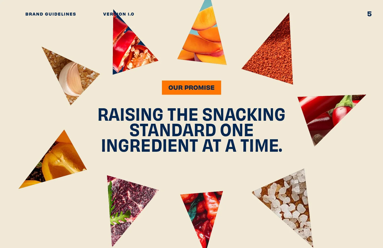
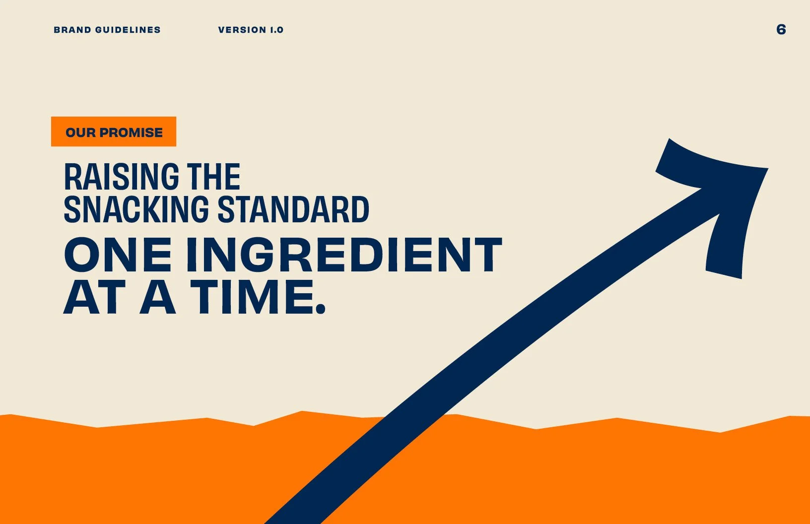
Brand Guidelines (sample)