Opal
Teeth Whitening CPG
Branding & Identity, Packaging
Role: Brand Strategy, Design Lead
Team: Sunshine Lemontree, ACD Copy; Alex Dodge, AD; Jose Vega, CW; Suzanne Deveney, UX; Brian Priest, SVP Strategy
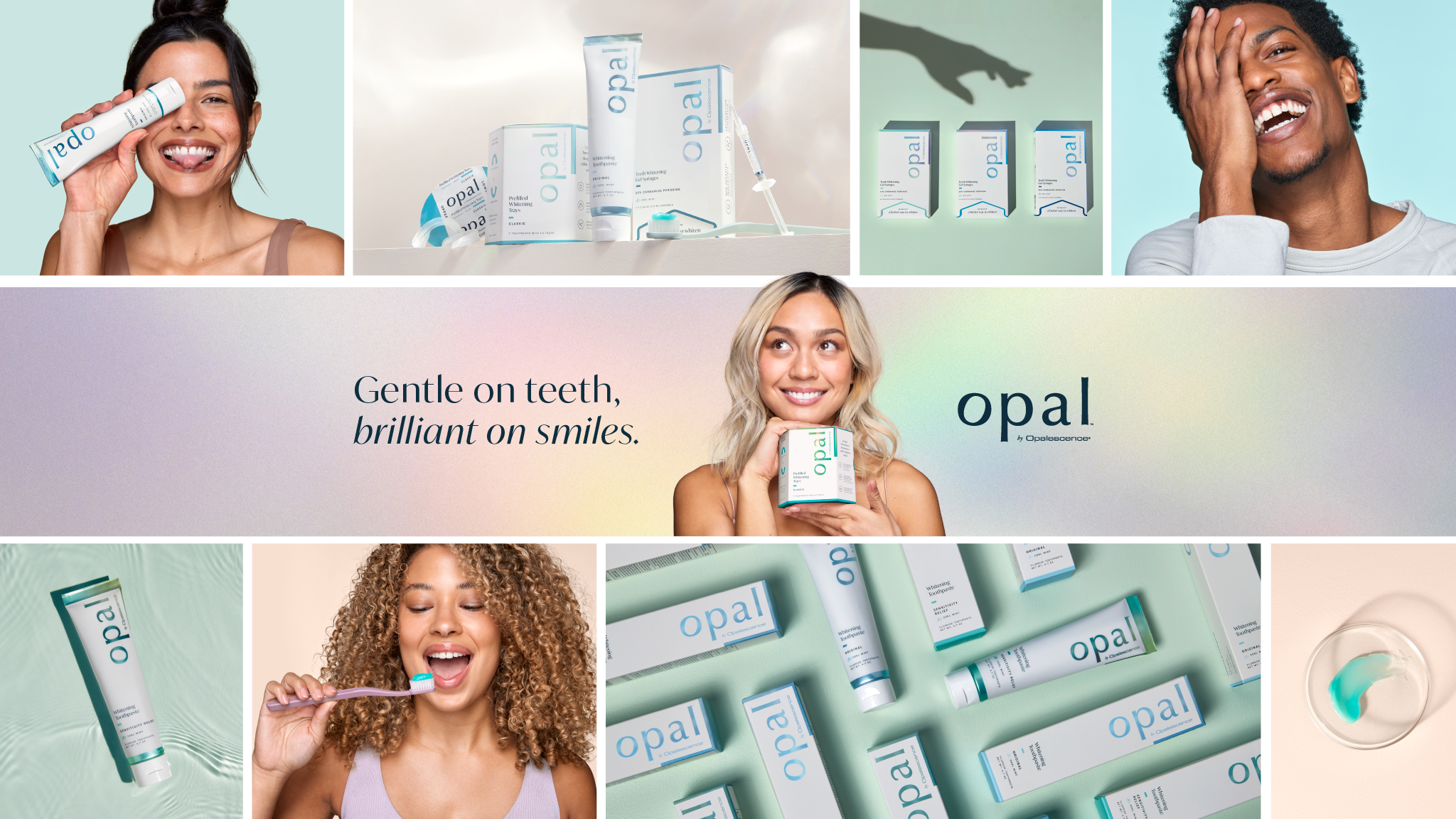
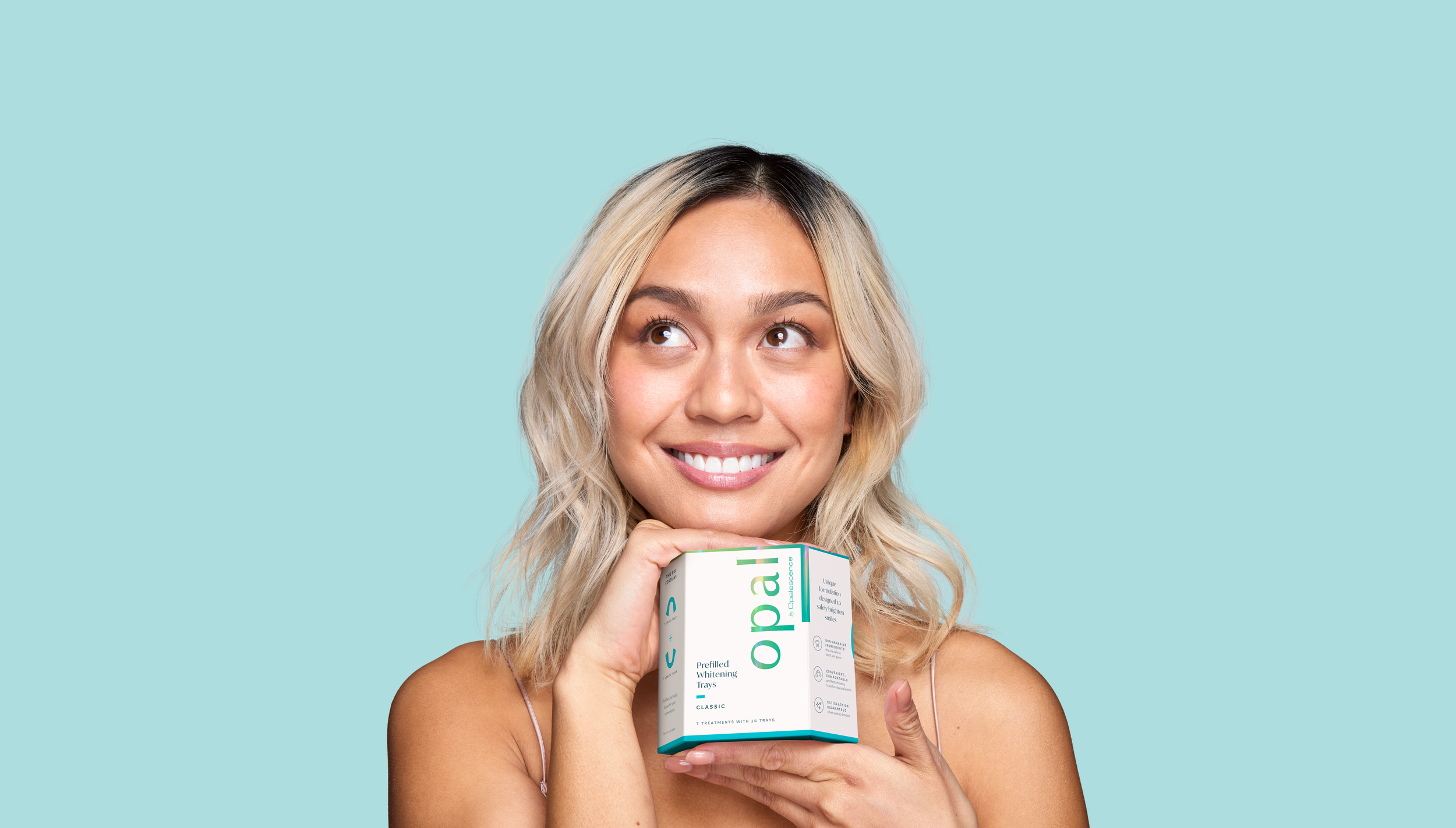
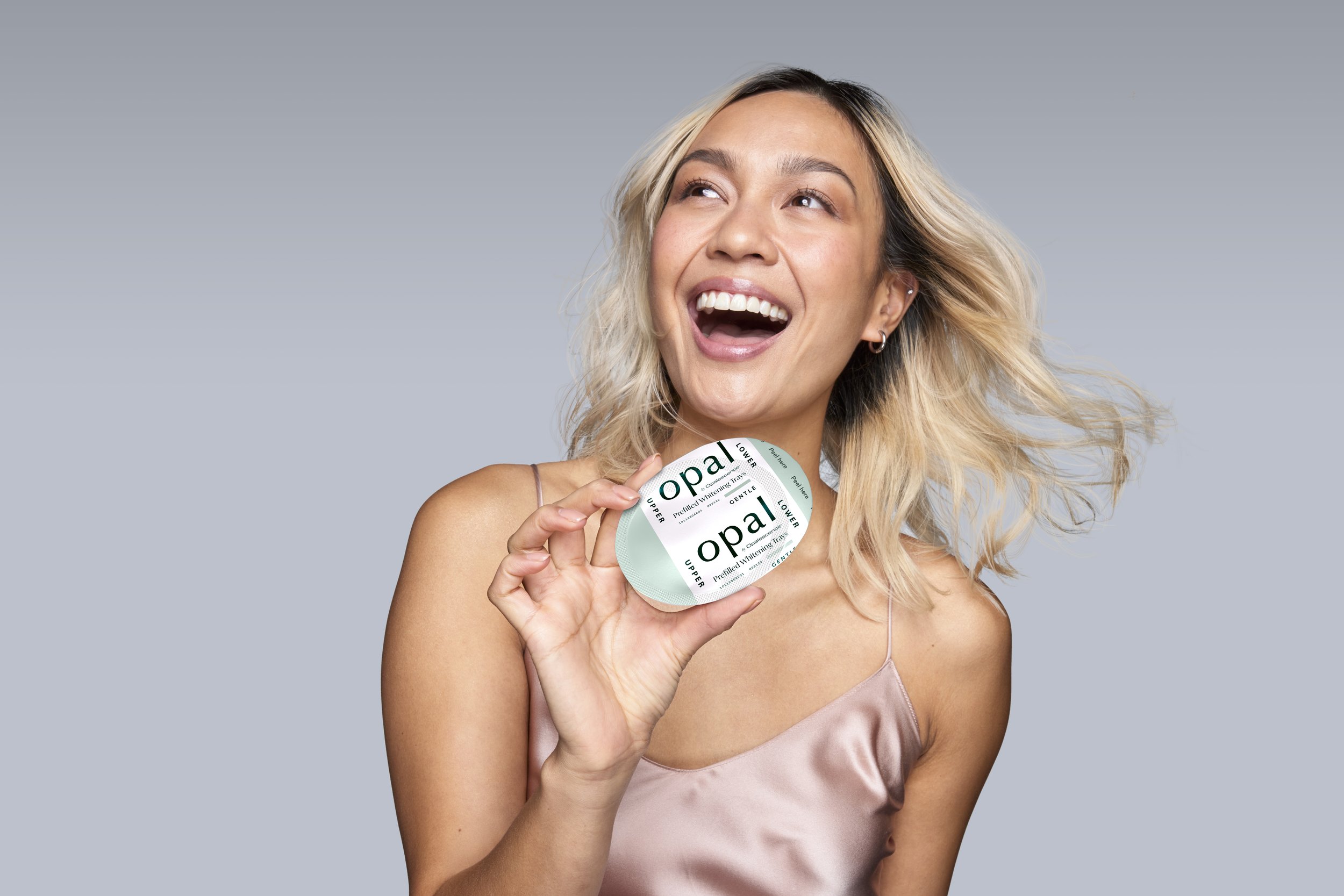
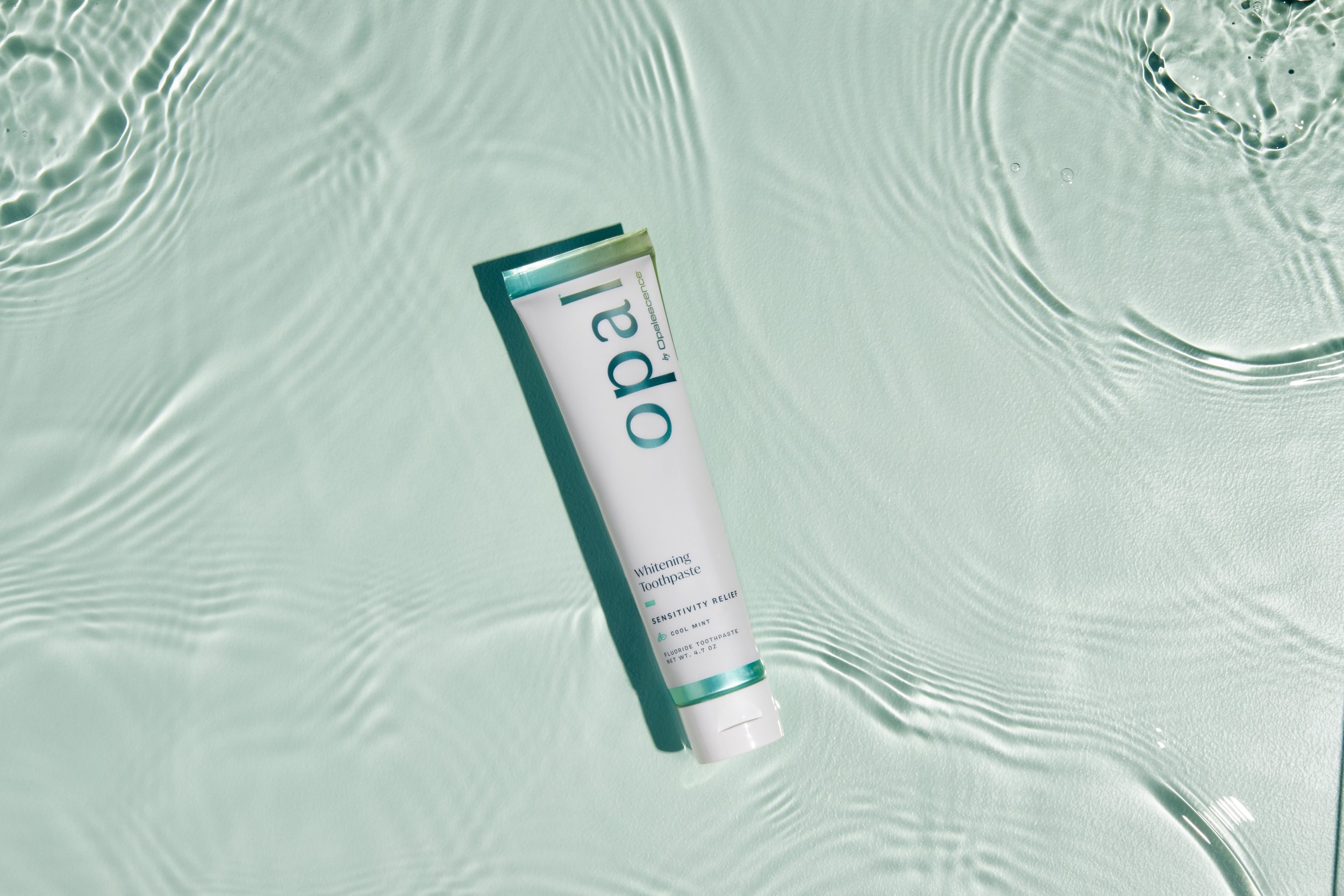
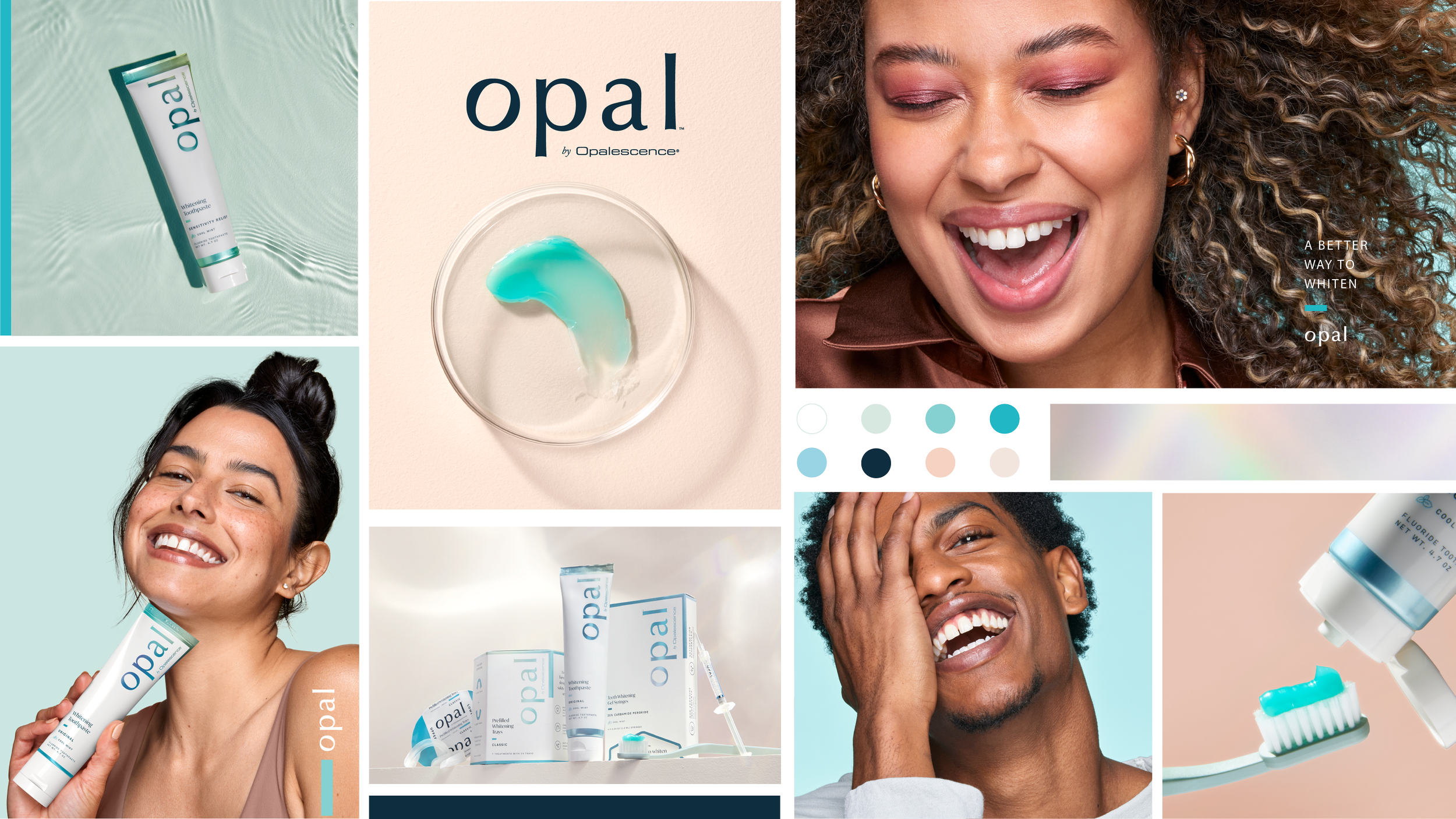
Opalescence, the world’s #1 professional teeth whitening brand, needed a distinct identity to enter the direct-to-consumer space. Enter Opal: a simplified name and a new brand built to cue beauty, personal care, and an elevated, trustworthy choice.
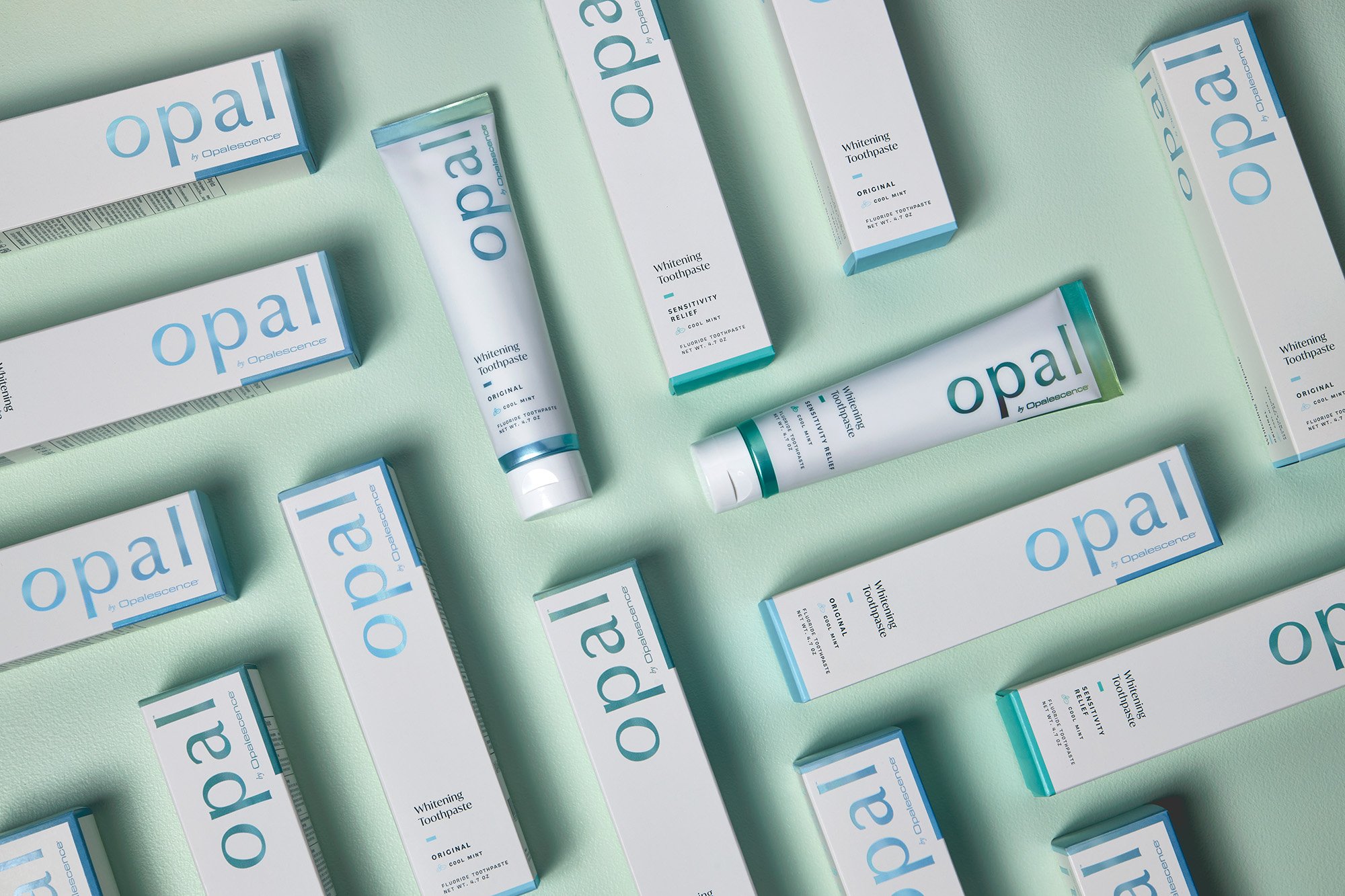
At the core is a packaging system that reframes whitening as gentle, considered care. Inspired by the opal gemstone, a soft, luminous palette and tonal shifts create cohesion and clear differentiation across SKUs, supported by a minimalist layout for easy navigation.
Breaking from the category’s high-contrast reds and harsh metallics, Opal feels calm, credible, and sensorial. The result is a scalable system that communicates gentle efficacy through restraint, positioning the brand as a more elevated alternative.
Services: brand strategy, brand identity system, logo design, packaging design, photoshoots, organic social, paid media, CRM, PR


Results
3.5x site visit increase
70% increase in revenue from CRM strategy alone
2x increase in ROAs
Brand Strategy


The logo evokes openness, airiness with a hint of beauty-brand polish. The counter of the ‘o’ is tilted forward, indicating positivity and possibility while drawing attention to opal-shaped negative space in the ‘o’, subtly reinforcing the brand name.